Analyzing stock data in the S&P 500 using the Modern Portfolio Theory
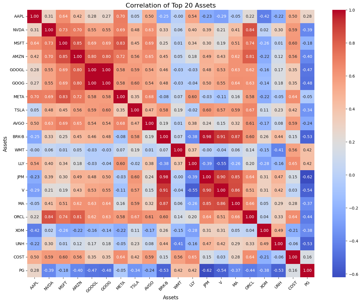
1/ Correlation Matrix
Calculated daily returns of 502 stocks in the S&P 500 from the last trading day of 2020 to the last trading day of 2024.
Used stock daily returns to calculate the covariance matrix to derive the correlation matrix for S&P 500 stocks to quantify interdependencies between assets; visualize with Seaborn
Demonstrated how asset correlations impact portfolio diversification and risk assessment.
The original matrix is 502 x 502, which is hard to visualize, so I limit the size to only include the top 20 stocks in the S&P 500
As seen from the matrix, stocks like JPM & BRK-B are highly positively correlated with each other (0.98) => their prices move together, can increase portfolio risk if held in one portfolio.
On the other hand, JPM & PG have the lowest and negative correlation (-0.68) => they prices move oppositely, helping to diversify and reduce overall volatility in portfolio.
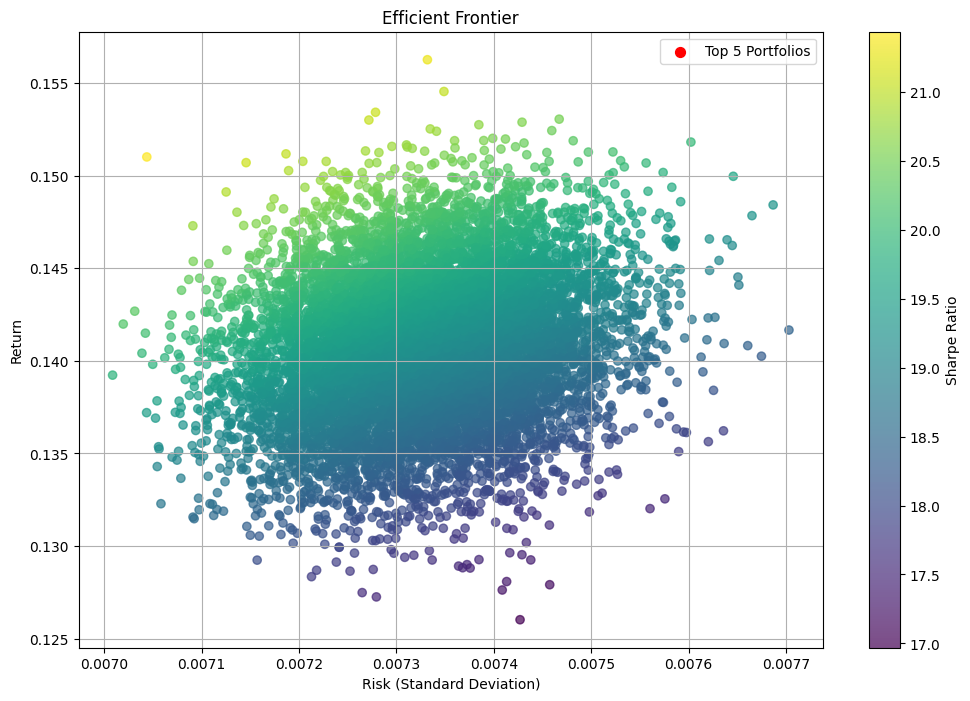
2/ Efficient Frontier
Derived the Efficient Frontier using quadratic optimization to balance portfolio risk and return; visualize with Matplotlib
Highlighted optimal portfolios based on minimum variance and maximum Sharpe Ratio to guide investment decisions.
X-axis (Risk): Measured by standard deviation of returns; higher standard deviation = higher variability
Y-axis (Return): The expected (or average) annual return of the portfolio.
Each dot in the scatter plot is a unique portfolio. Each portfolio is a combination of some of the 502 stocks in the S&P500.
The efficient frontier is the outer boundary of this plot, featuring portfolios that maximize return for a given level of risk, or minimize risk for a given level of return.